Art and Product Managment: Holiday Food as an Iterative Product

I love hamentaschen – a traditional holiday filled cookie – for so many reasons. The mathematics of turning a mostly flat circle into a 3-sided pyramid. The effort of pinching the points, the glorious feeling when the cookies come out of the oven and look great. The social aspects of giving hamentaschen away and baking with friends. The flavor combinations – including savory hamentaschen. And, I mean, it’s a cookie…I love cookies!
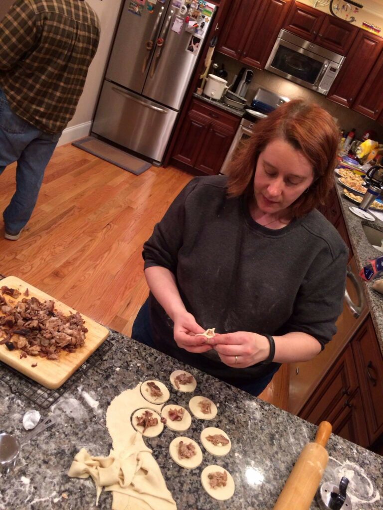
Me, filling savory hamentaschen, 2014

As much as preparing food fulfills my desire to provide comfort and nourishment for myself and others, there’s always a background process asking, “how can I make this better?” This is a concept familiar to product managers and engineers alike; my iterative development process is not limited to the computing realm.

Welcome to my kitchen, where culinary craftsmanship meets the art of optimization.

One challenge of holiday baking is that lessons learned can get lost in the flurry of activity and to-do lists. It’s easy to forget previous learnings. Stressful situations like more people than originally planned or too many items for the oven have lead to experiments where I figure out which brisket is more flavorful and fall-off-the-fork delicious – baked in the oven or the slow cooker? (Answer: surprisingly, the oven!)

To combat this challenge, I heavily annotate and change recipes, and keep menu plans with notes of quantities, number of guests, and how well everything worked out.

Holiday food preparation is especially prone to the Pot Roast principle
(reference: https://www.psychologytoday.com/us/blog/thinking-makes-it-so/201402/the-pot-roast-principle). The process is infused with stress – we are usually preparing several dishes, to meet a specific deadline. We don’t have time to question what’s the most efficient use of our time, resources, or even oven space. We may take for granted that a certain food has to be cooked on a stove or in an oven, or even that we should prepare it the same day we eat it.

Savory and sweet hamentaschen from the 2014 epic hamentaschen-baking party!

Another challenge is that often, holiday food preparation can be chaotic because there are multiple dishes to make. I don’t do a big Purim feast (though maybe I will in the future). I especially love Hamentaschen for experimentation because it’s the only recipe I’m making. I have the time and the space to think, “how can I make this better?” and “What about this is really working for me?”

One effect of baking Hamentaschen only once a year is that the iterative process has a long cycle. For example, I prefer a more “open” hamentaschen, where you can see the filling. I learned this after too many years of eating mystery-filled cookies….I like to know what I’m getting into! I don’t like the mystery; if want raspberry and I get chocolate it’s disappointing.

Hamentaschen from 2012 – they’re almost all closed, which has two problems for me: I like to know what’s inside the cookie when I choose it, and I like a dough:filling ratio that has less dough and more filling than these did.

There are so many minor variables that can be changed, and with less frequency, it takes a while to tweak the variables exactly how I like them. For example – many people use jam, or chocolate chips to fill their cookies. I personally don’t like how jam reduces and is sticky, and how chocolate chips are a very dry filling on what is usually a dry, crumbly cookie. In fact, I don’t like a shortbread-style, crumbly cookie for hamentaschen.

For the 20 years I’ve owned the process of baking hamentaschen – e.g. not baking with someone else who dictates the process. I’m still innovating and changing things after all this time, because when you make something once a year, the iterative cycle is long. Interestingly, I’ve not done much experimentation with the dough itself. My family’s recipe uses some orange juice, which solves the problem of a flavorless sweet dough. And my twin brother long ago tripled the amount of butter from our mother’s recipe so the dough is not crumbly.

In addition, inviting people over to make the cookies is not just a fun activity to do with friends. Some of my friends have never made hamentaschen and it’s a lesson in how much of a learning curve making these cookies are. As a product manager, I have to balance being an expert in my product, with working with people who inherently are NOT experts in the product. As a hamentaschen baker, I have to explain to friends how thin to roll out the dough, how big or small of a circle to cut, how much filling to put in, how to make the shape, and how to pinch the edges closed. And of course, how variations in each of those steps change the cookie – some of those changes are objectively “good” or “bad”, but many are personal preference.

The process really brings me back to beginner mindset, reminding me that something I’m an expert in feels easy to me because I have lots of experience in it. For folks who haven’t developed the same experience over years, learning all the details can be overwhelming when they just wanted to come over and bake cookies. Audience expectation and management are important skills!

Bakers try to make sure their hamentaschen hold their shape and don’t flatten. Through the years, I have come to realize that the filling is as important as the dough itself. Chocolate chips are often used as filling, but I find them too dry and hard after baking. I prefer a more brownie-like chocolate filling. While it is popular to use jam or jelly as filling, I personally don’t like that those fillings. They have a tendency to reduce while cooking, which means the end product has less filling, and a different dough-to-filling ratio than I like. Jams and jellies also become watery when heated, so leaks are more prevalent. And I just don’t like the sticky texture of those fillings when cooked.

And it wasn’t until this year that I realized that a filling that does not reduce, has a great side effect – it helps the hamentaschen hold their shape better. So even if the dough flattens a bit, or the edges aren’t pinched well and open, there is no leakage.

All these cookies have the recognizable shape of hamentaschen, even though the levels of “openness” vary, due to the structurally sound filling

Poppy seed filling is traditional, but also one of my favorites. I prefer the Solo brand poppy seed cake and pie filling, where the poppyseeds are combined with just enough of a sticky sweet syrup to hold together. In my area, this filling is most prevalently found in December, so I buy what I need then, otherwise I can’t always find it in the grocery store in February or March when I want it. This is the kind of optimization I do, learned after many years – I buy my hamentaschen filling a few months ahead of time!

One problem my family has had in eating the cookies, is that I like to make both chocolate filled hamentaschen and poppy seed filled hamentaschen. Sometimes it’s hard to tell the difference. This year I got the great idea to fill the poppyseed cookies last, and mix some poppyseeds into the dough so that it is very clear which cookies have poppyseeds and which do not. I lament that it took me over 20 years to come up with this stroke of genius, but it’s to be expected when I only bake hamentaschen once a year.

So, now that this year’s hamentaschen baking is over, what next? I’ve written down my idea for next year. See, my dough recipe makes 4 dozen cookies (cut to 3 inch circles), but the cans of pie filling and my chocolate filling recipe makes enough to fill 3 dozen cookies. It’s not the math that’s difficult, I can multiply by 3/4, but I want to keep some standard measurements – 1/4 cup of orange juice nicely changes into 3 tbsp, but the butter comes out to 153 grams, or 10.8 tablespoons, or 1.35 sticks. None of these are useful for me, so I’ll work on standardizing the recipe without losing any of the characteristics I love about the dough.

Fewer than 1% of meals are holiday meals. Is it ridiculous to optimize, solve challenges, be so attentive to detail, and innovate on something that only happens rarely? Maybe, but that’s just how I am.
Art and Product Management: Experimentation

Gelatin plate monoprinting is a form of printmaking that utilizes a gelatin plate as the printing surface, as opposed to a carved block. The basics of printing are that we apply paint/ink to an object, and then print that onto another surface like paper or wood.

With a more traditional carved stamp of linoleum, wood, or even a potato, we can print many copies of the same design easily. This is called block printing. The print grabs most of the paint, and we apply more paint for the next print.

In gelatin plate monoprinting, we start by creating a design on the gelatin plate using various tools and techniques. Once the design is complete, the plate is inked and pressed against paper to create the final print – just as with regular printing (or silk screening). The paper grabs most of the paint, and we have an empty gelatin plate again.

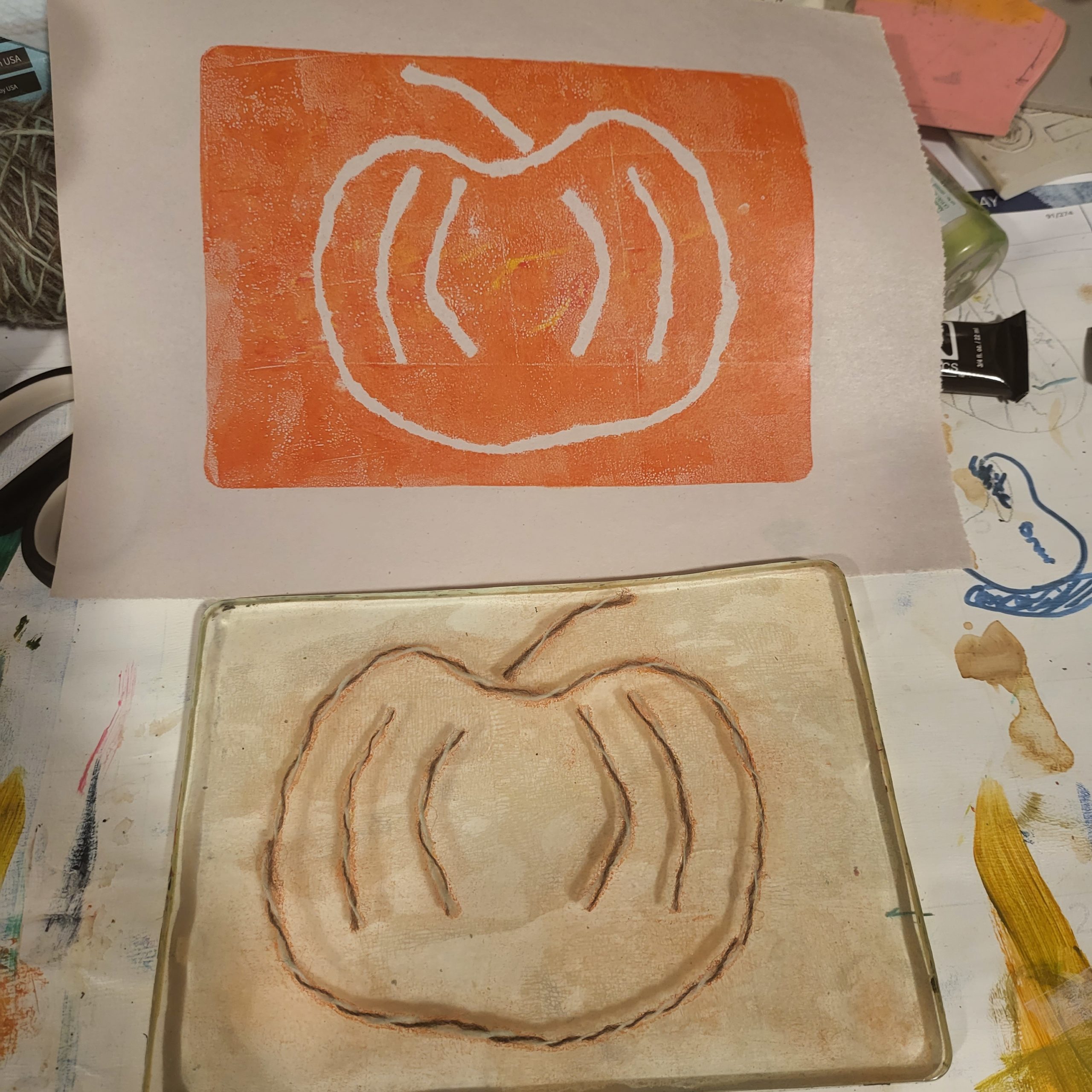
The bottom half of this image shows a gelatin plate with yarn on it, forming a simple pumpkin shape. The top half is the print that just came off the same gelatin plate - an orange field with a pumpkin shape outline that is the color of the underlying paper.

Hence the term “monoprinting” – making one print. This is a detriment if we have a design you love that you want to print over and over; it’s a benefit if we haven’t figured out that perfect design. With block printing, we carve the design ahead of time – there’s an upfront cost.

The beauty of monoprinting is that the plate can be reused and modified again and again, allowing for endless experimentation and iteration.

This process is similar to how product management experiments are done, where different strategies are tested to find the best solution. Before we “carve a block” – create the product, whether it’s a software product, a physical product, or even testing a strategy – we want to experiment with different elements to see what’s going to be optimal.

One key aspect of both gelatin plate monoprinting and product management experiments is the concept of iteration. In printmaking, the artist can continue to make adjustments and modifications to the plate, testing out different techniques and tools to see what works best. In product management, experimentation allows product managers to try out different ideas and strategies, gathering data and feedback to inform future decisions.

We want to be able to set up and complete experiments quickly, and in a way that teaches us something. Often, product management (and art!) experiments do not dig deep enough into failures and successes. Are we learning more than “that didn’t work”?

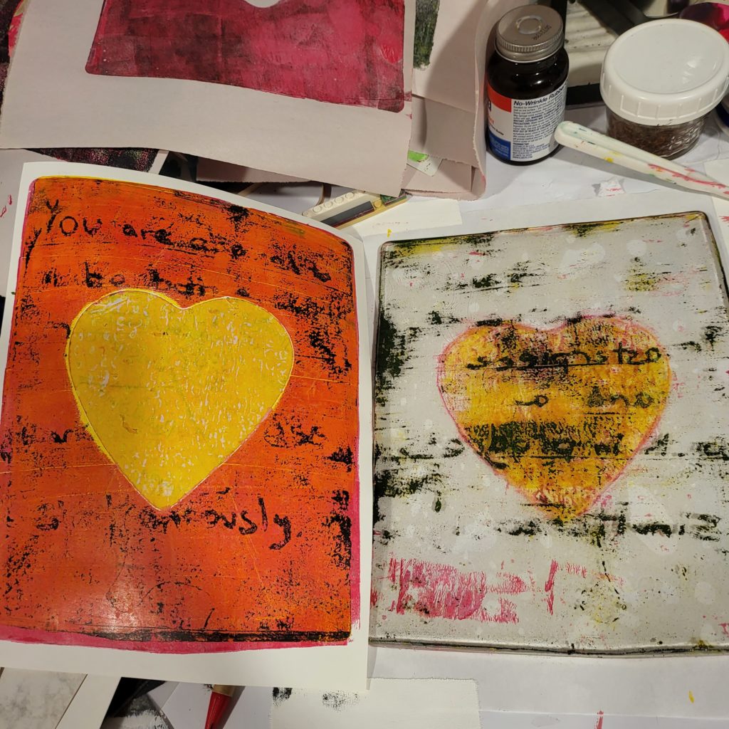
The right half of this image is a gelatin plate with a ghost image - some writing, especially in the middle where there is a yellow heart mask. The mask ended up splitting, and the top part of the heart-shaped mask ended up on the print. The print takes up the left half of the image, with a plain yellow heart in the middle, on an orange background, with some black text that did not come off the gelatin plate in a readable manner. This is a failed experiment.

With gelatin printing, I’ve learned a lot the hard way, especially when layering prints. I need to understand more than just “when I put that blue on top of that purple, it disappeared.” I need to understand if it’s possible to EVER put blue on top of purple – it is possible! – and if so, how to do it – use an opaque blue. I can buy a more opaque blue; I can go a step farther and learn how to make the blue I have more opaque.

Similarly, we need to understand more about why our product experiments succeed or fail. Often our experiments succeed in testing but fail in the ‘real world’, and we don’t dig deep into the factors of success before declaring victory and proceeding to develop the product.

Another critical similarity is the element of surprise. Gelatin plate monoprinting is known for its unpredictable results, as even small changes in the plate can have a big impact on the final print. In product management, experimentation can also lead to unexpected and valuable insights. For example, a product manager may discover a new use case or customer segment we did not consider before.

It’s important to note that experimentation doesn’t necessarily mean that the final product will be perfect, as in product management it’s not always possible to have the perfect solution. Both in gelatin plate monoprinting and product management, the process of experimentation and iteration allows for continuous improvement and learning.

The unpredictable and creative process of gelatin plate monoprinting can serve as inspiration for product managers to think outside the box and approach problem-solving in a unique way. Both techniques allow for continuous learning, improvement and adaptability, leading to the best possible outcome.

I have also found that failing fast in art helps me be more comfortable with running experiments with an unknown outcome – if this idea fails, I can try another one. And in the end, most of the time, I make the biggest mistakes first – so I can get those out of the way in the experiments.

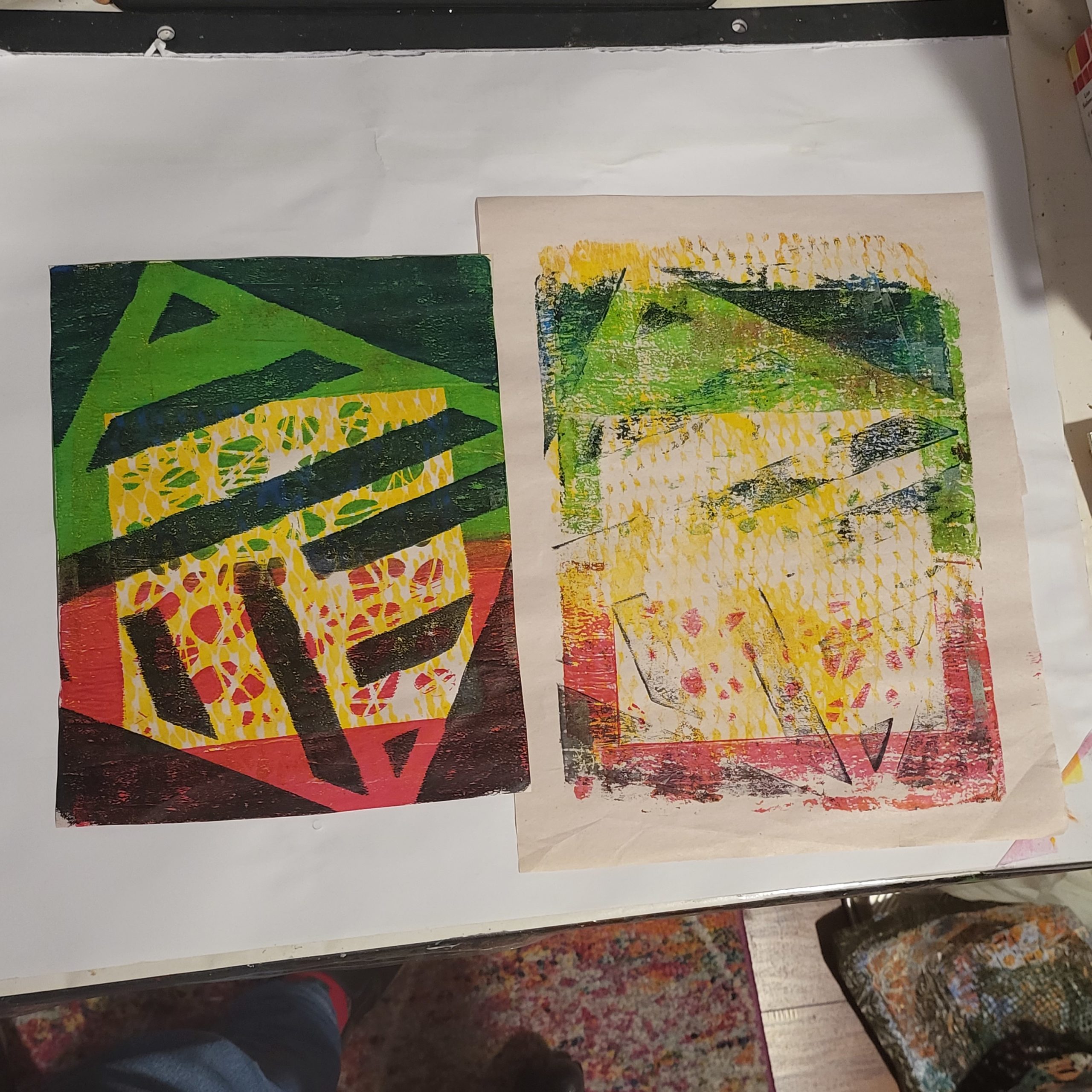
This image has 2 monoprints in it - the monoprint on the right is a mess of layers that did not work out - 2 stencils and netting, with no background so a lot of the original paper is showing through. The monoprint on the left has a yellow mask of a stencil, on a green and red background, with another stencil layered on top in black. Experiments help us determine what works and what does not, so that we can produce what we want to.

Less is More

I constantly struggle with saying too much. To be honest? I often lose that struggle.

I lose because I want to explain more. I want to address every question that might come up. I want to make sure there is an understanding.

Paradoxically, though, after a point, more information complicates the topic. It becomes more confusing, not less.

Lately I’ve been deleting whole sentences. It’s OK to leave something open for people to ask about.

I thought of this today because of a recent art exploration, using yarn or string to mask paint, picking up the unmasked paint with paper, then removing the yarn/string and picking up the rest. The idea is to aim for what you want in the 2nd print.

I was underwhelmed with the effect in the video I watched. And then I did it. And I LOVED it. And I realized that with very few lines, a lot can be evoked in a drawing.

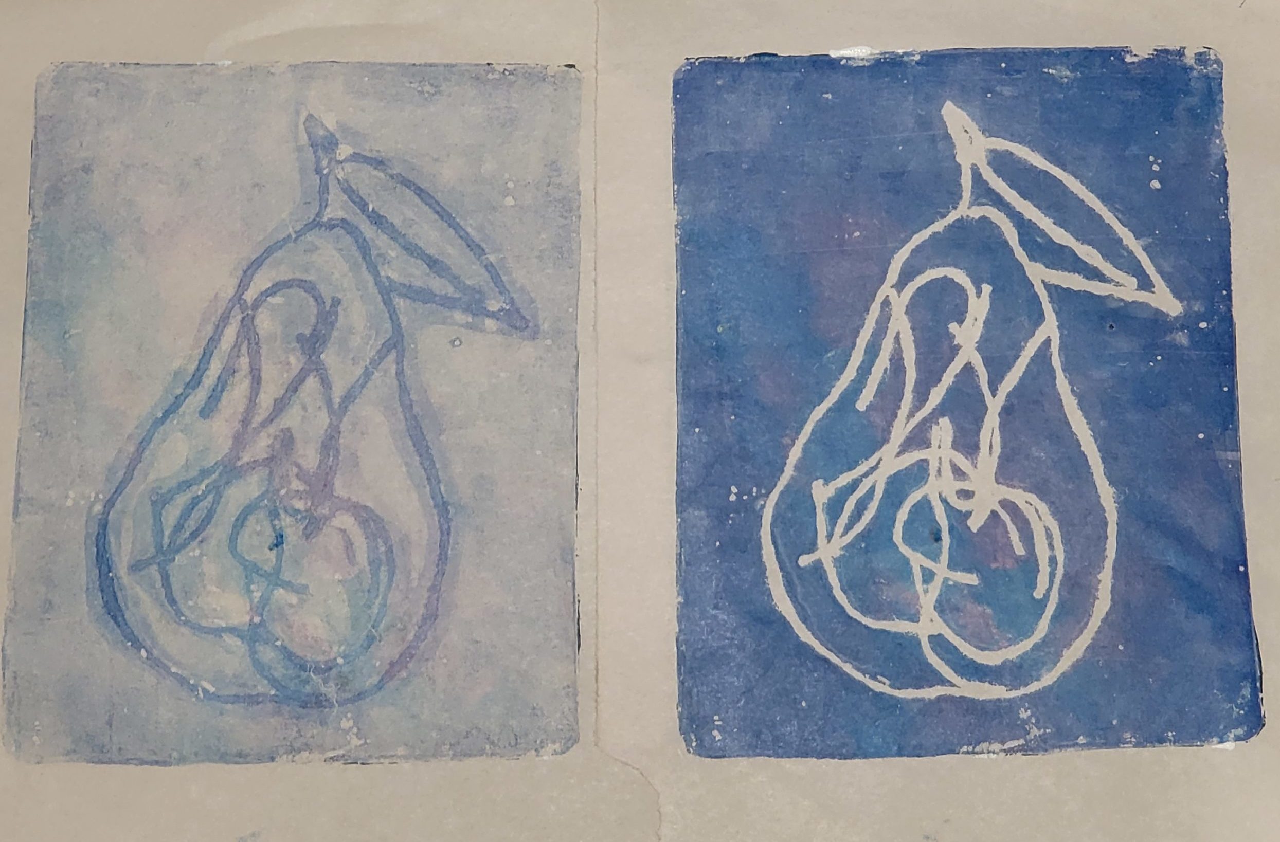
2 prints of pears in blue with purple tinges. The one on the left is the first print, where the outline of the pear and the internal texture is left blank with paint filling in the rest. The one on the right, the target image, has the most paint where the yarn was.

With the first set of prints, I added in some texture in the center of the pair. But I realized – I did not need to. It would be every bit a pear, with that detail removed.

So I tried another experiment, and like the pear, I really like how this came out:

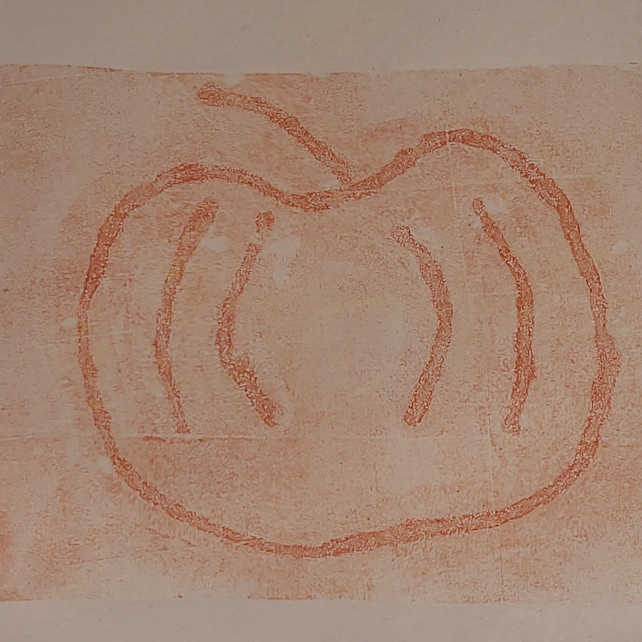
Same style as before, but this time 1 image - just the 2nd print of what the yarn left behind. The image is of a pumpkin and the lines are in orange.

A reminder that less can be more. In art, in speaking, and in correspondence.

I will (ironically) add a caveat here, which echoes Teresa Torres – drawings can say so much with just a few lines – more so than just a few words or sentences. I’m glad to have this reinforced even though I have yet to work on my own product management drawing habit.

Vacation As a Product Manager

Recently, I went on a 5-day vacation. It was terrific, but not because we did once-in-a-lifetime experiences. It was terrific specifically because we did “regular” vacation things.

I planned this vacation as I do most planning as a Product Manager – I started with the requirements.

Requirements

I started with coarse basics – what’s the goal of the vacation? To get away with my kids and have fun together. So I came up with a list of requirements, product management style – that is, no solutions:

  1. No flights. That’s a COVID risk I’m not willing to take yet, for a vacation. When I planned this trip a few months ago, we did not know when vaccines would be ready; as it is, by the time the vacation began, my 3-year-old had gotten one shot but was not fully vaccinated yet. Buses and trains are OK, as is driving, but nothing more than six hours or so of travel.
  2. Get away. Not a “staycation.” If we saw local sights, we should at least be in a hotel so I could be present with my kids and not worry about doing house chores.
  3. Accommodate my 3-year-old napping in the afternoons (approx 1-3 pm) and general flexibility. My 6-year-old has anxiety, and sometimes we simply have to leave. A timed experience with no re-entry means I have to be willing to go and lose the entry fee if the situation calls for it.
  4. Something engaging for my kids that they will love. They’re 6 and 3 years old, and I don’t want to spend the whole vacation trying to convince them to do something fun or listen to them complain.
  5. Focus on being active, preferably outdoors. Since it’s summer where we live, that wasn’t too difficult.
  6. Accommodations: Hotel or rental house, strong preference for a pool in the hotel, at least one bedroom that’s separated by a door so the kids can go to sleep and I can stay up without bothering them.

High-Level Solution

Once I had the requirements, I could engineer possible solutions. Requirement #1 helped narrow down what we could do. Living in Boston, we could go to the Berkshires (mountain range three hours away), New York City (four hours away), the beach, arbitrary city (Lowell MA, Mystic CT, Hartford CT, etc.), Mount Washington, amusement parks (Six Flags and Story Land)…there’s a lot of options.

However, since it is all within driving distance due to requirement #1, it was by nature something repeatable. It wasn’t a trip to Paris where I would regret not seeing the Eiffel Tower. If we didn’t see something, we could go back some other time.

I wanted to focus on an activity that was best or only possible in summer, which ruled out a lot – for example, New York City has tons to do, but summer’s heat makes everything, well, stinkier.

Accommodations were a big part of the decision – I ruled out tent camping, it’s a lot of work, and I wanted to have a vacation too. I settled on Cape Cod, basically the beach, with the second choice of Story Land because in a few years, my kids will be too old for it.

I looked for hotels or rental properties on Cape Cod, within walking distance of a beach, for the easy back-and-forth. And something that had a pool – my kids LOVE swimming and jumping into a pool. If I couldn’t find something that met our accommodation requirements on Cape Cod, we could try Story Land. I was lucky and found a beach place and booked it.

A hotel pool with blue shimmering water, and a rope with oval plastic buoys separating the deep end from the shallow end. The shallow end is in the foreground, marked as 3 FT. A three-year-old in a yellow and blue life jacket, and purple long sleeve bathing suit, is in the pool and holding on to a handrail by the pool stairs. A 6-year-old is across the pool horizontally, still in the shallow end, slipping headfirst from an inner tube decorated like a watermelon. The 6-year-old is wearing red and blue swim trunks and goggles.
Having fun in the hotel pool

My partner isn’t an outdoorsy guy, so I told him he didn’t have to come, and called my sister and invited her to go with us. This way, I’d have help wrangling the kids so I could relax on vacation too.

Things began to get complicated – my sister decided to sell her house and move while the market was hot, as her youngest is going off to college this fall. The move was nine days before the vacation, so we kept the vacation planning to a minimum until after she moved.

Tools of the Trade

Usually, we use Google Sheets to plan vacations – one sheet for ideas, one sheet with a column for each day once we figure out activities, and one sheet for figuring out who paid for what and making it fair at the end. Google Sheets isn’t lightweight on mobile devices, so I asked around and decided on a Trello board.

We liked that URLs were clickable, and things were easy to move around – we brainstormed ideas in one swimlane, then had one swimlane per day and moved around activities as we saw fit.

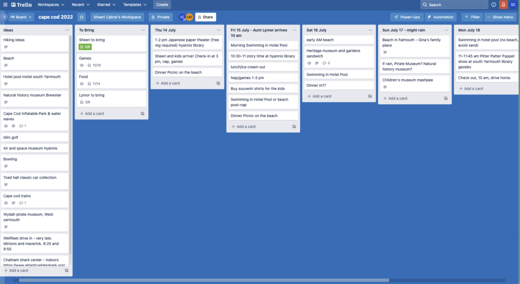
A trello board with several swimlanes, many activities in the 'Ideas' swimlane that did not get moved to a swimlane for any day
Our Trello Board, click to expand the image

Vacation: The MLP Version

An inflatable park sounded really co0l, but did I want to spend $100 for all of us to go for just a few hours (nap time interrupts things) and risk leaving after only an hour or so if my kids weren’t having a good time?

My 6-year-old LOVES trains, but there’s not much to do ON a train – did I really want to spend $90 for an hour on a train when my kids might get bored in the first 5 minutes?

I spent about 2 hours researching ideas. In the end, we didn’t do most of them, we spent most of our time in the pool, at the beach, and playing games together – my 6-year-old’s current favorite is Mille Bournes.

Playing in the sand at the beach.
We dug a river in the sand at the beach
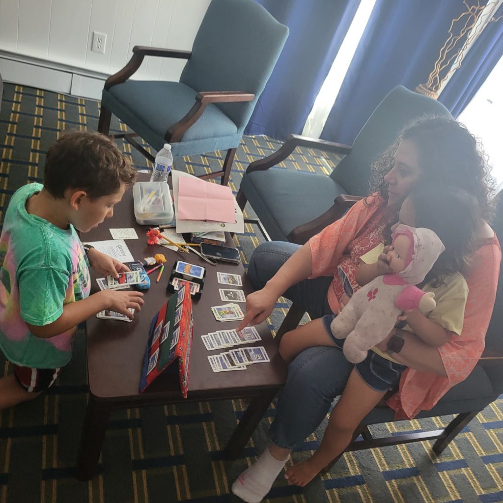
An adult and child playing a card game on a coffee table in a hotel room. The child is kneeling and looking at a card holder with 6 cards in it. The adult is pointing to cards on the table in front of her, while a 3-year-old sits on her lap. The 3-year-old is holding a pink doll.
Playing Mille Bournes with my sister

Thursday, we arrived too late to see the Japanese paper theater. Sunday, it did not rain, but my 6-year-old developed swimmer’s ear, so my sister took my 3-year-old to the beach near our hotel while I took my 6-year-old to Urgent Care. We then met them at the beach. Unfortunately, we couldn’t go to Gina’s beach, but that also meant less driving around. Monday, we packed and left since checkout was 10 am; we found a local playground and then had lunch. We avoided the pool to avoid more swimmer’s ear.

MLP stands for “Minimum Lovable Product.” In the MLP that was this vacation, M stands for “minimal” – my kids are super happy swimming or playing in the sand, so that’s what we did. For food, we had free breakfast in the hotel, went to a supermarket a few times for lunch supplies and snacks, had dinner al fresco at a restaurant, or got food delivered to our hotel room.

We did make it to story time at the library on Friday morning, and we did one excursion – to the Heritage Museums and Gardens. We found the maze, looked at a Wampanoag wetu, saw art sculptures made from trash, spent time in a lily garden with a waterfall, and played in the Hidden Hollow and Treehouse. We were hot and tired after a few hours so we stopped by the indoor, air-conditioned automobile exhibit on our way back to the car. We left lots unexplored, including the labyrinth and carousel – which we can do next time.

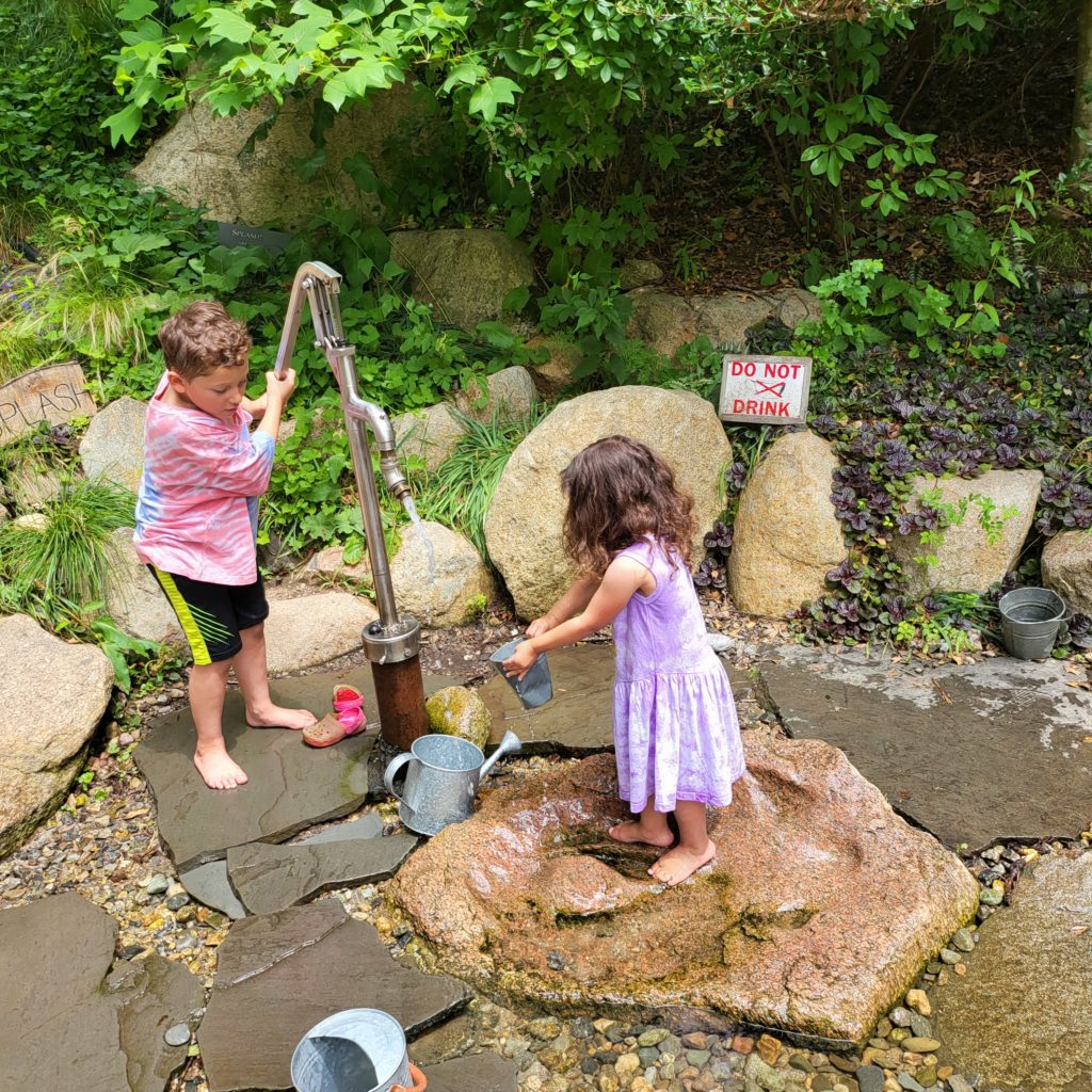
A 6-year-old kid with short brown hair in a salmon-colored tie-die shirt and black shorts operates a water pump. The water coming out of the pump is coming near a small galvanized metal bucket being held by a 3-year-old kid with long curly dark brown hair wearing a purple tie-dyed dress. Both kids are barefoot. They are standing on rocks and slate in a shallow water feature, with rocks and greenery in the background.
Playing in the Hidden Hollow
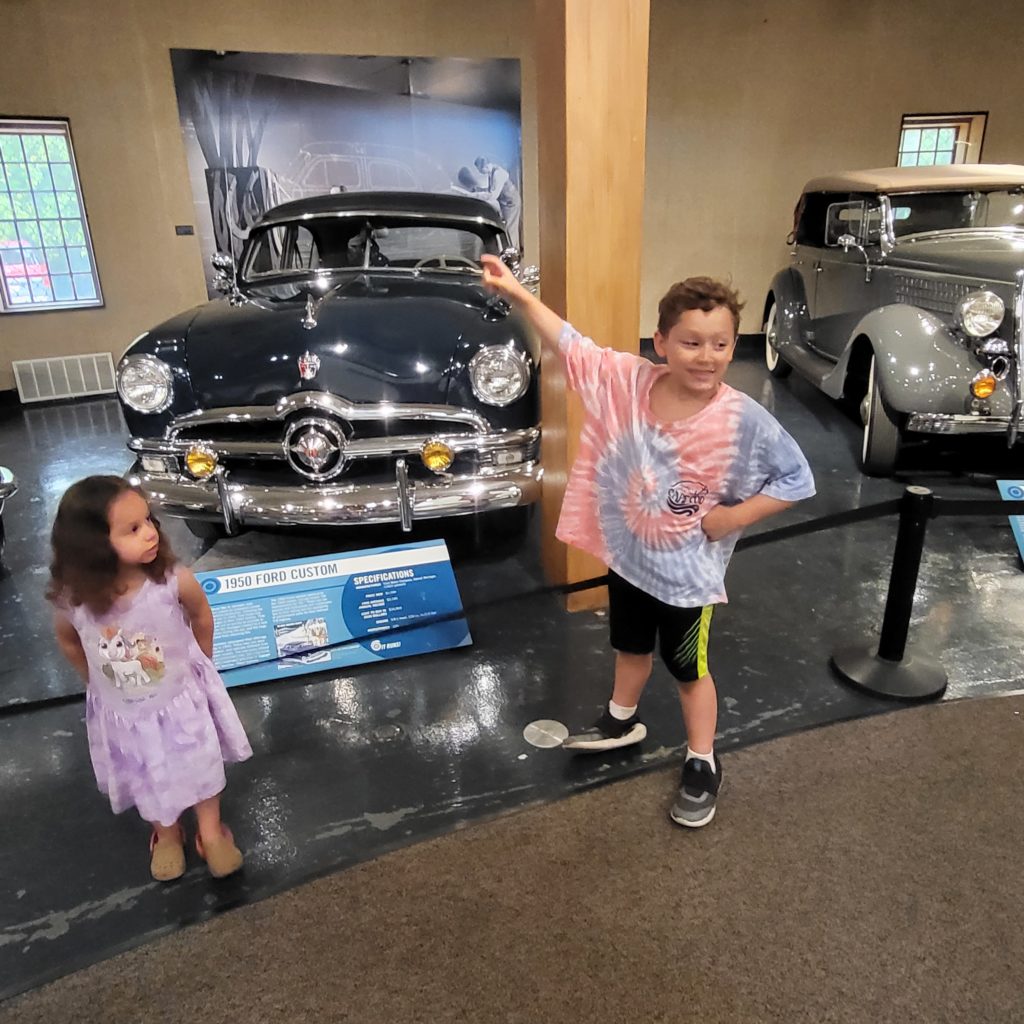
A 6-year-old with short brown hair in a tie-dye shirt, black shorts with a green stripe, and socks and slip-on shoes points to a 1950's dark blue Ford. A 3-year-old with long black curly hair in a purple tie-die dress with a unicorn on it and tan crocs looks at the 6-year-old.
“Look, Mom, it’s Doc Hudson from Cars!”

Unexpected Extras

As minimal as it was, there were some unexpected extras that happened, mostly good ones:

  1. I thought I booked a 2-room hotel suite. As it turned out, it was a 2-bedroom hotel suite, complete with a separate living room, full kitchen, and full bathroom. I decided to invite my mother along, as she also needed a vacation, and we had the room. She carpooled with my sister and really enjoyed relaxing and doing nothing.
  2. It was handy to have other adults around, so I could take one kid to urgent care when I had to.
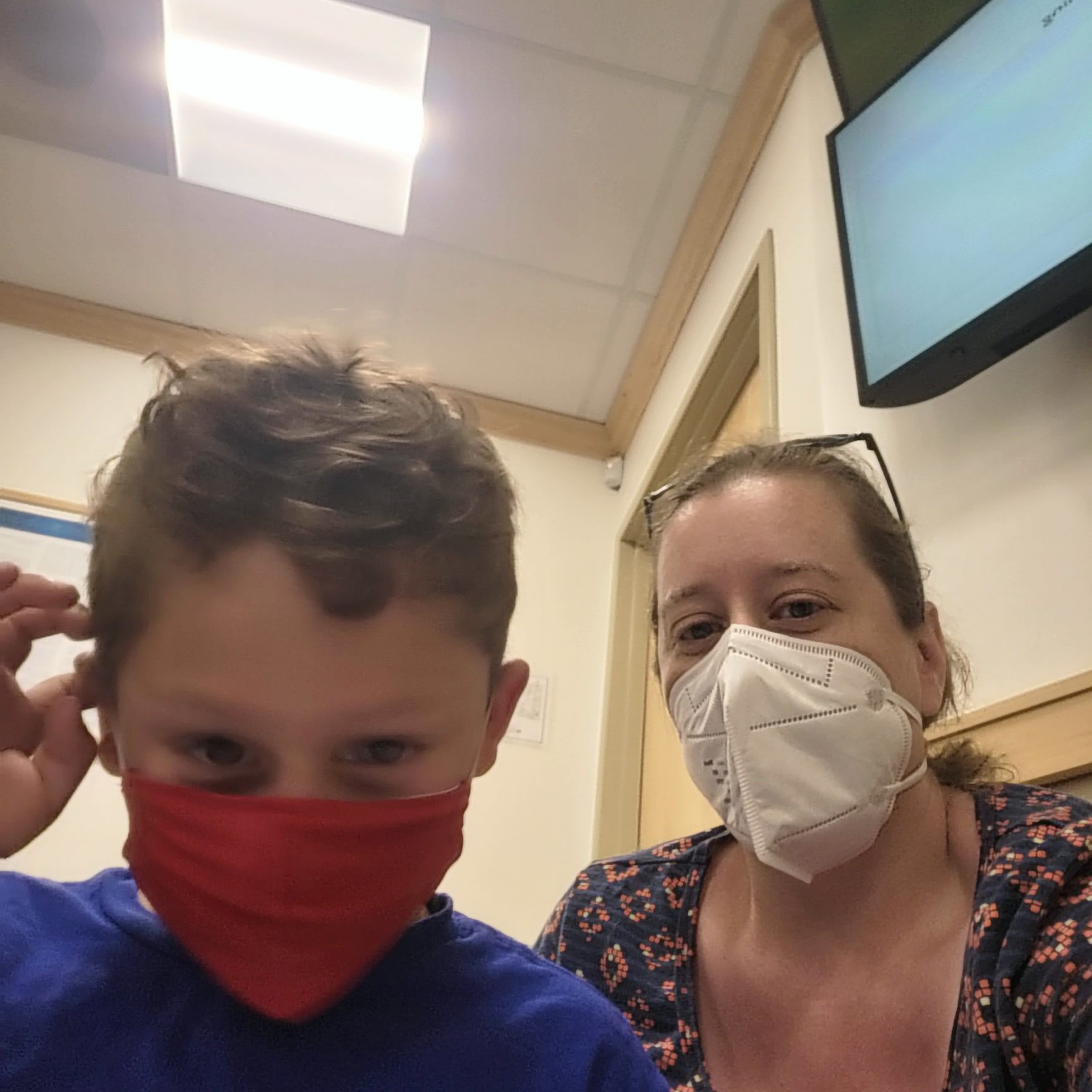
    A selfie with a 6-year-old with short brown hair, blue shirt, and red cloth face mask on the left. On the right is the author, a person with brown hair tied back, sunglasses perched atop her head, white N95 mask covering her chin and nose, in a dark blue shirt with a geometric diamond pattern in orange.
  3. My mother and sister took my kids to the beach one morning and let me sleep in. I got an extra TWO hours of sleep!
  4. My mother and sister babysat the kids Saturday evening while I had lunch with a friend who has a family house on the Cape.
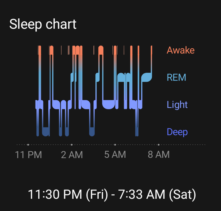
  5. My kids wanted to sleep with me, and I learned that my 6-year-old tosses and turns ALL NIGHT. A sleep chart showing 8 hours and 3 minutes of sleep from 11:30 pm Friday to 7:33 am Saturday, with 10 'Awake' periods interrupting sleep every few hours
  6. My partner invited a friend over and had a great weekend without family responsibilities. Win/win!
  7. I brought my computer “just in case.” I did not open it once. I did no work. Some of that was luck, and some of that was my awesome coworkers covering for me.

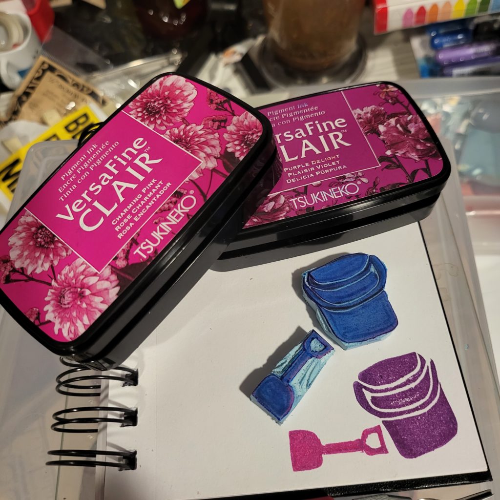
After the trip was over, I carved two small stamps to commemorate the occasion. Like the vacation, they were simple, easy, and filled me with happiness:

Two VersaFine Clair inkpads, in pink and purple, dominate the top half of the image. They rest on a small spiral notebook with unruled pages. On the lower half of the notebook page are 2 hand-carved, blue stamps depicting a beach shovel and bucket. In the lower right quadrant of the page the stamps have been impressed on the page, showing a pink shovel laying horizontally just to the left of a purple bucket.
I carved minimal stamps to commemorate my minimal vacation.

Conclusion

So, what’s the tl;dr on how to I had a good vacation? I set core requirements and met them – minimally.

The One Where I Scream Into the Cloud

Did you know DBAs could have personalities?

Which is more exhausting – being oncall, or having a newborn?

What does a Product Manager of Technical Lineage for ETL Tools do?

How many times do I say “right?” in 36 minutes?*

For all this and more, listen to my interview on the latest Screaming in the Cloud podcast, or read the transcript at https://www.lastweekinaws.com/podcast/screaming-in-the-cloud/technical-lineage-and-careers-in-tech-with-sheeri-cabral/ or wherever you get your podcasts.

* the answer is 32

What Does Transparency Mean?

One of the things I love about making art is that it often inspires me to make connections I had not made before. I’m currently working my way through Julie Balzer‘s A Year of Gelatin Printing class, and there’s a month called “Layer Layer Layer” that includes a lesson on transparency.

The first technique was simple, as the outcome was not meant to be the artwork. In order to assess whether or not a particular tube of paint was transparent, the lesson was to grab a book page* and apply paint to it, to see whether or not the paint is opaque, semi-transparent, or transparent.

It is not a particularly challenging lesson, which gave me time to think about when I might want different levels of transparency, what kinds of layering I might do.

a book page. The middle has no paint, the top has a layer of transparent orange, the bottom has a layer of semi-transparent red.
Transparent at the top, semi-transparent at the bottom

Suddenly my brain leapt to a realization – transparency in a business context is often stated as a binary. I’m a huge fan of smashing binaries to get the rich matrix that lies beneath, and this was no different.

Transparency can mean:

  • Decisions, and reasons for making those decisions, are talked about openly.
  • Being open and honest about bad news, a project going off track, or a timeline change, instead of covering these up.
  • Recognizing those who supported your effort, helped with research, or lent their eyes and opinions to make your work better.
  • Sharing your roadmap publicly, and sharing any changes publicly
  • Agreeing with a coworker or customer who has complaints about your product
  • Being forthcoming about product or team limitations

Of course, transparency can be taken too far. There are plenty of reasons for privacy – discussions with HR (including hiring, retention and losing employees), not telling employees about a big change (e.g. merger) until you know it’s going to happen so uncertainly doesn’t spread, and of course personal details such as government ID numbers, bank information for direct deposits, and authentication credentials.

Transparency is not simply a matter of making information available, though. Good transparency is not just a permissive shared folder or wiki; good transparency ensures that people are well-informed.

For example: let’s say the 50-page employee handbook changes. Transparency is on a spectrum, with one end being an oversimplified notification:

Please note, the employee handbook has changed for US employees.

This is the equivalent of making everything public and letting people sort out for themselves not only which information is significant, but what, if any, changes there have been to call awareness to. It’s not particularly useful for transparency – it’s opaque, like the top section of black paint on this book page:

a book page, with an opaque thick black strip at the top, the middle has no paint, and the bottom is semi-transparent through brown paint
Opaque at the top, semi-transparent at the bottom

Semi-transparency, such as the brown paint at the bottom of the page in the image above, might be to explain what has changed:

Please note, the employee handbook for US employees has been changed to reflect the following policy changes:

– “Hairstyle” and “hair texture” are now explicitly named as protected categories under discrimination, harrassment, and equal opportunity employment.

– There is a new section explaining the ban on firearms at the workplace.

Also known as, “Please don’t make me read 50 pages to figure out what changed!”

I pointed out that this might be semi-transparent, as it depends on how it’s done, and if it accurately portrays important changes and downplays unimportant changes. Of course, what is important can be different for different departments, teams and people at an organization, so this can be a bit trickly.

Similarly, full transparency is highlighting what changed – this method calls out exactly what changed, like a version history or file diff. If there are very few changes, this can illuminate what changed better than a description of the changes. However, if there are a lot of changes, a summary might be better.

What would the most useful form of transparency be? Well, it depends on the recipient as well. I would prefer a mixture of the three, if there are a lot of changes; if there are a few significant changes, highlighting would suffice; and if there are many repetitive changes, an announcement is fine – e.g. “all instances of dog have been changed to pet”.

I’m sure we all have stories of how too much transparency caused issues – not being able to find a document or conversation because all docs and conversations are public.

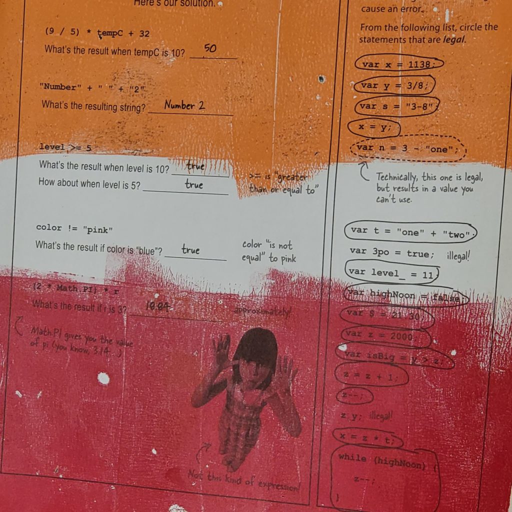
* I have an old copy of Head First HTML 5 Programming I use for painting on book pages

It’s the Little Things

More than once, I have said that one of my KPIs for my performance reviews should be “hours of meetings my manager [or coworker] no longer needs to go to.” Usually when I come onboard, I am helping ease a tough workload, and it makes me happy to be able to help.

There are many small ways I try to make the lives of my coworkers easier. Many of these items save more time for my coworker, than they take for me to do. And I believe they are good practice overall.

Send a Link

If I could wave a magic wand and have ONE of these items always happen, it would be this one: SEND A LINK.

So often, I get an email or chat message that refers to an existing document or presentation. If the message does not contain a link to the presentation…in the best case scenario, I type a key phrase into my address bar and my browser’s smart search finds it. In a slightly worse scenario, I cannot locate it easily and have to go digital spelunking.

In the worst case scenario, I have no idea which document or presentation is being referred to, and I have to either figure it out, or ask for a link.

If the message contains a link, I can click it and be there. This saves a lot of time because usually when you’re messaging about something, you are looking at it or recently have looked at it. The link is readily at hand, in your paste buffer, or in your clipboard history (if you’re on a system without a built-in clipboard history, find an app to get one, they’re super handy!).

Give Appropriate Context

Giving a link is a subset of giving appropriate context. This can be difficult to get right; however, there are some bits of context that are usually appropriate. In fact, the previous point – “Send a Link” – is about giving context!

Now, this is something I suffer from on both sides, as I am both an over-explainer and have a terrible memory, and often need a bit more context than people provide. Here’s an example:

Hi, here’s the file we talked about in the meeting we had.

I have a lot of meetings every day, and a terrible memory. I’m really good at writing down “Follow up: X promised me Y report”, and with this I might have to go to my notes if I didn’t remember. However this, only slightly longer, gives me the details I need:

Hi, here’s the report on lineage usage that we talked about in the KPI meeting we had.

Here’s another example. I was going to send our beta program lead a Slack message like this:

Hi! I’m ready to put information into the beta software now. Where do I start?

I realized that she runs lots of beta programs, so I should give her some context:

Hi! I’m ready to put information into PROGRAM for the NEW_TOOL technical lineage beta test. Where do I start?

This may seem trivial, but it can help people decide whether or not to handle your task immediately or wait until later. If I know what that report is, I know if it’s something I need to study, or can just glance at. If I’m doing a pass through my e-mail, and I can glance at the report to get what I need, I’m going to do that right away. Otherwise, if I know I need to study it, or I’m not sure, I’ll save it until after I’m done checking my email for the most important items.

In the most egregious case, I once saw a message where someone said

Look at the first three errors, you’ll find what you need.

This was from someone asking for help, and it’s quite likely they read the error messages and didn’t quite understand what was going on. And in fact, they asked for clarification. What they were looking for was something along the lines of:

It seems like a string was provided as a numerical input.

I suspect the messenger was trying to “teach how to fish”…This could have been done by saying something like

The first three errors are where the problem is – the first one points out the file that had the issue, the second points out the function, and the third, the line number of the problem. It seems like a string was provided as a numerical input there.

For Dates, Specify the Month, Date, AND Day of the Week

When talking about dates, ALWAYS give the day of the week as well as the month and number of the day. Here are some illustrative examples:

Are you free next Thursday for a meeting?

Today is Tuesday…are you asking if I am free to meet in 2 days, or in 9 days?

Are you free June 8th at 3 pm for a meeting?

I have no idea if I’m free on a particular day for a meeting without checking my calendar. This is perfectly reasonable, however, this is better:

Are you free Thursday June 8th at 3 pm for a meeting?

There are 2 reasons this is better. Firstly, I know I have a regular meeting at 3 pm on Thursdays. So instantly I know – I cannot make a Thursday 3 pm meeting.

Secondly – June 8th is Wednesday. June 9th is Thursday. Any date typos are going to be caught very easily if both the date and day of the week exist.

I have been involved in frustrating discussions where an organizer discussed dates at length only to realize in the end that they had typo’d the date originally. It’s so easy to type 8 when you meant 9; it’s much less frequent to type Wednesday when you mean Thursday.

It’s not just for scheduling (which some would argue can be done automatically by applications). Here’s another example:

“The conference is June 13-14th, 2022. Can you make it?”

Is that conference during the week or a weekend? This is something that’s ubiquitous and one of my pet peeves. Please don’t make me look at a calendar if I don’t have to!

Time Zones

Unless you are 100% sure everyone involved is in the same time zone, specify the time zone. Avoid abbreviations if possible – don’t make people look something up if they don’t have to. “3 pm” is not as specific as “3 PM CET”, but much more descriptive is “3 pm Central European Time”.

As well, try to avoid summer time/daylight saving time abbreviations. People often get these wrong. “3 pm EST” when it’s summer in the US looks silly. It likely won’t be confusing to anyone, but it could cause confusion when you’re on the cusp of a time change. “3 pm Eastern US time” is much more accurate.

Note that even though the official time zone is called “Eastern Time”, I put in US, because not everyone knows which east coast this is referring to.

What are your favorite things to help make life a bit easier, ensuring that people love working with you, and also getting information from others faster?

What Does Frictionless Onboarding Look Like?

Earlier this week I had a nearly frictionless onboarding experience, and I want to memorialize it in something easier to find than a tweet. Here’s how my user scenario played out.

I finished writing my presentation and wanted to put it online. Usually I copy it to a folder and link it to the presentations section of my CV and call it a day.

I’ve always wanted to embed slide decks in a post or on a webpage, so that people can see the slides and get what they need. Sometimes that information is the content on the slides, and sometimes that information is “is this the presentation I want to download”? I myself have downloaded a presentation, only to find out that it wasn’t what I expected. When the slides are online, I can skim them to verify if I should download it to go deeper.

So, I decided to see if there was an easy way for me to embed a PDF on a webpage. Here’s what I did:

  1. Do a web search for “embed PDF in website”
  2. Read some articles, learn that Adobe has something called the “PDF Embed API”
  3. Land on https://developer.adobe.com/document-services/apis/pdf-embed/
  4. Noted that it’s free and there’s a demo – click “Try the demo”
  5. Play around with the demo until I see a mode I like
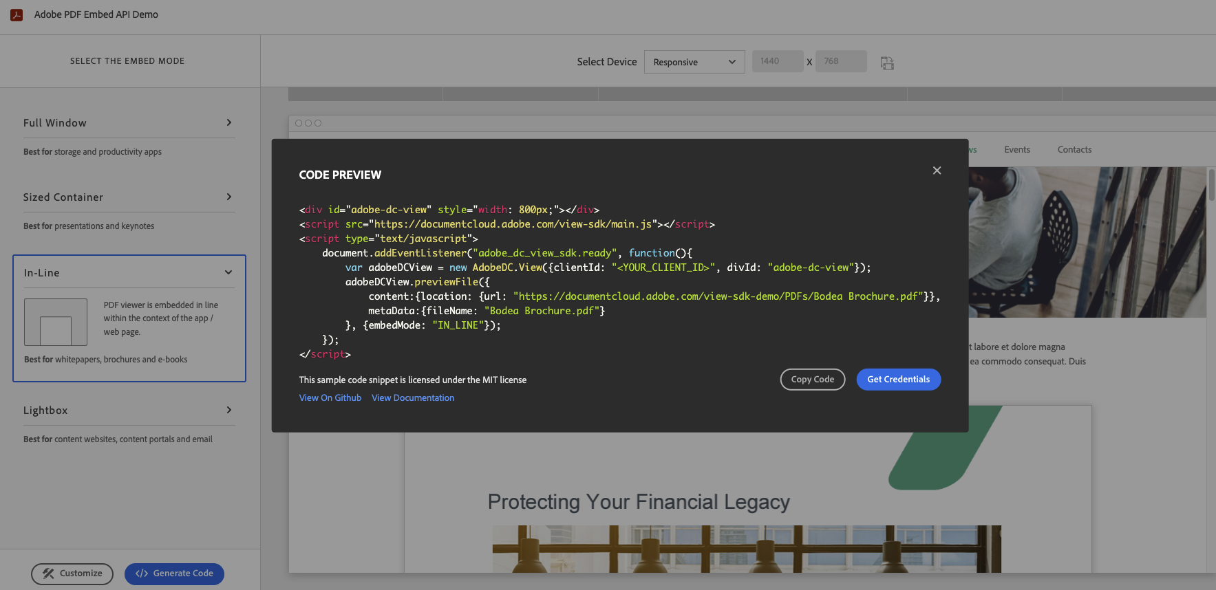
  6. Click “Generate Code” and see fewer than a dozen lines of code, with easy ways to copy the code or get my own credentials.11 lines of HTML/javascript code to embed a PDF in a website
  7. I click “Get Credentials” and login to a new browser tab with my existing Adobe account. If I didn’t have one, I could create a free one right away.
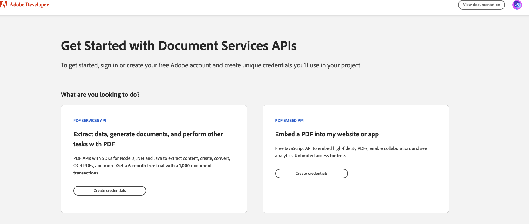
  8. I am presented with a choice of which service to get credentials for – something that has more functionality and costs money, or the simple embedding service that’s free. I click the free one! 2 choices of credentials to get
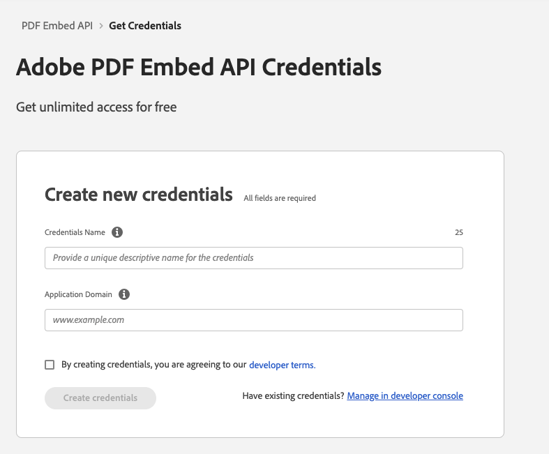
  9. I only have to enter in 2 pieces of information – the domain name that will call the embedding API using this credential, and a descriptive name that I’ll use in the developer console if I need to distinguish between multiple credentials.A form with 2 fields to fill out, plus a checkbox to agree to the terms of service, and a button to submit the form. Additionally I can go straight to the console to manage existing credentials.
  10. I clicked “Create credentials” and got my credentials!
  11. I went back to the demo page – it was still there because “Get Credentials” opened up in a new browser tab. I clicked “Copy code”.
  12. I created a post in my blogging software and pasted in the example code.
  13. I read the example code to see if I could figure out what to change. I guessed that I had to enter my credentials in <YOUR CLIENT ID>, and change the url and file name of the PDF.
  14. I got extremely excited that it had only been about 10 minutes since I started step 1, and clicked the “preview” button to see if the PDF would render as a nicely embedded document.
  15. I ran into an issue where I own 3 domains – sheeri.com, sheeri.net and sheeri.org, and I used a different domain for the credentials than I’d used for the URL of the PDF. I fixed it, and shortly I had success and saw my slides beautifully embedded:

I personally was up and running in 30 minutes. HOWEVER – most users will not have the issue that I did due to my own non-standard setup, and be up and running in 10 minutes.

Self serve, 10 minutes to be up and running, without reading a single word of documentation. It’s the dream!

On Twitter, Ben asked me:

How does this compare to PDF.js (https://mozilla.github.io/pdf.js/)? Instinctively I’d suggest that replacing a proprietary external dependency with an open-source self-hosted dependency is a win, but I’ve never tried using Adobe’s PDF Embed API.

Ben Howe

I loved this question, especially his explanation of why he’d start with PDF.js. My replies were:

Adobe’s solution is very low code. I pasted a dozen lines of code, changed three parts, and it just works (filename, path, my api key). PDF.js starts by explaining the concept of promises to me….I don’t need a primer on that, I just need to display the thing.

Do you think you could go from finding the web page to having it working in 10 minutes? That’s the big difference I see. As the thread touted, it just worked. I’ve spent more time on this Twitter thread than I did getting it working.

I get that open-source self-hosted is best – but – I don’t want to compile something. PDF is a proprietary format INVENTED by Adobe. I feel Adobe has more resources and incentive to support PDF displaying than Mozilla (smart devs but not a ton of $, I worked there for 5 years).

Sheeri

So there you have it – a beautiful user experience, with the confidence that it will probably work for at least another 20 years given what Adobe has invested in the PDF format.

Artistic Wandering and Product Management

So much of what we hear, see, and make is shaped by always changing, multi-layered sets of ideas and ideals. Art helps me level up so many skills; among them, the ability to follow a wandering path, make connections, and build understanding.

I got back to playing with paints on a gelatin plate and made some art I like. My definition of art is extremely vague: “something created with intention and/or meaning.” Here’s an example:

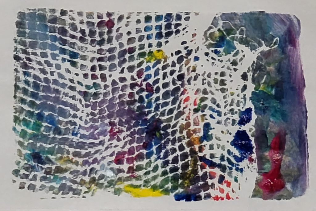
paper on print rectangle art Abstract

This piece’s intention is technique-based – I was following a lesson to use a paintbrush to paint on the plate, then apply a printing technique.

I painted, then put netting between the paint and the paper.

In this way, I intentionally made a print that was different from painting directly on the paper.

What does this have to do with product management? I find that being creative and letting my mind wander helps me understand my thoughts, opens up my mind, and creates new neural pathways. Increasing my ability to understand thoughts and patterns is directly related to leveling up my Product Management skills.

It also feels good, scientifically.

Another PM superpower is listening. One way to develop listening skills is to listen to myself. What does my own inner monologue reveal about the connections I make? What do I do when something isn’t going as planned? Am I deeply invested in the direction I want the art to go in – why or why not? Am I satisfied if my art turns out different than I intended?

My starting limits were the size of the gelatin plate – 5″x7″ (approx 13 x 18cm) – and the paints I used. I was using a new set of paints that had 6 colors: yellow, red, magenta, blue, green and white. I decided to only use newsprint to print on – I have other materials but it had been months since I painted, so I wanted to keep it simple.

Here’s what I created, and my inner monologue. See how my thoughts translated into the artwork:

blue, red, yellow and green all interplay in this abstract art print

It’s Pride month, I’ll start with bi pride colors, blue on top.

White for the middle of the plate, magenta on the bottom, then I’ll combine them for purple in the middle.

Before I combine, this blue/white/magenta reminds me of the French flag. France . . . cheese! I’ll paint yellow triangles.

I used most of the colors but not green…the moon is made of green cheese…so some circles in green. And swirls.

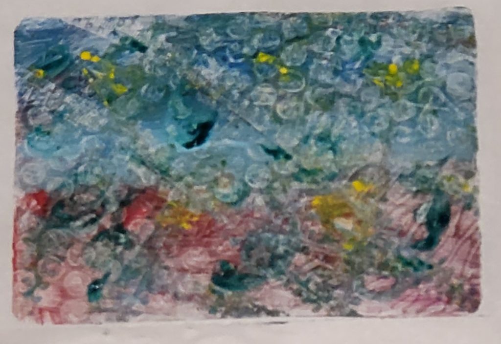
OK, now do something with it that gives it a reason to be a print. Let’s run this car with textured tires over the plate. And now let’s apply this bubble wrap. OK, now to put the paper on and print it.

My intention – a bi pride flag – completely changed after I painted a little, and my brain made the connection to the French flag. The end result is something I happen to like to look at. Do I look at it and think of a French cheese, like Camembert? No.

This is practice – going through the process of creating one piece of art. It’s practice following the threads to the initial idea, to the final outcome. It builds up discovery skills. It helps see patterns and make connections – helpful when listening to understand customers, stakeholders and employees. It’s also helpful when creating or updating strategies, tactics and other plans.

So much of what we hear, see, and make is shaped by always changing, multi-layered sets of ideas and ideals. Art helps me level up so many skills; among them, the ability to follow a wandering path, make connections, and build understanding.

Getting to No: Tactics and Scripts to Stay Close to Your Path

Whether you’re trying to get alignment on goals, strategy, tactics; or stick with them during quarterly planning, daily standups, and when urgent items come up – you need to be able to recognize which ideas will lead you astray, and be able to resist them, while growing and maintaining good relationships.

This talk, first presented at Building Products That Matter, Together addresses the tough work of being able to execute your plans effectively. Attendees will learn how to figure out what to accept, delay and reject, as well as learn several scripts of how to reject and delay ideas without destroying trust and goodwill with stakeholders and customers.

Here are the slides – you can see them here and use the menu at the top right of the box (3 dots, “hamburger menu”) to download the slides if you prefer:

The video is available on ProductBoard’s website – it requires a login, but it’s completely free.